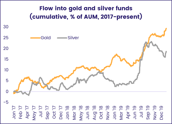
It is an article of investible faith that geopolitical and financials crisis, natural disasters and epidemics translate into greater demand for gold and other precious metals. The coronavirus outbreak centered in Wuhan, China certainly fits these criteria and has generated a predictable flight to gold in its various forms.
Fund flow data has, over the years, proved useful in confirming surges in demand, measuring the relative strength of that demand and identifying the inflection points that signal a shift in sentiment towards gold (see chart below). But using this information leaves investors making largely qualitative decisions about the optimum exposure to this asset class.
One alternative is the use of flow data for a range of mutual fund flows into and out of several commodities to build a model that takes the guesswork out of the best time to rebalance a commodities portfolio.
Getting a relative fix
EPFR’s Commodity Model is one tool for achieving this. It relies on aggregated 20-day fund flows to pick between gold, silver, energy and agriculture.
The operation of the Commodity Model is based on the following steps:
- Computing the daily percentage flow into each commodity. This is total fund flow into the commodity scaled by the total AUM of all funds investing in that commodity.
- Compounding the daily-percentage flow over a trailing twenty-day window.
- Ranking the four commodities into four buckets based on the latest-available twenty-day flow percentage for funds tracking that commodity so that, after each rebalancing, the commodity with the highest flow is in quartile one (Q1) and lowest flow in quartile four (Q4)
- Investors go long Q1 and short Q4, holding the position over a weekly, fortnightly and monthly period
- The model rebalances at the end of the chosen time period.
The table below shows annualized returns to each quartile in excess of that to the equal-weight basket of commodities.
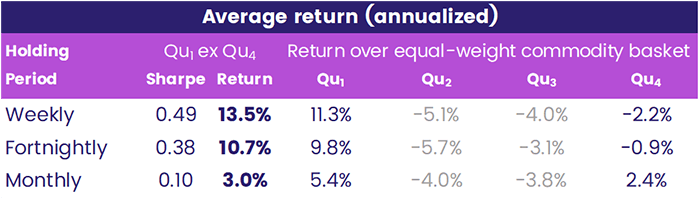
This table also show the quartile spread, the annualized return difference and the associated Sharpe ratio (which favors the shortest duration) between the highest-flow and lowest-flow commodity.
One of the risks of such an approach is that increased short interest in an ETF often causes an inflow into that ETF. This happens because the borrowing cost of the ETF rises leading providers to create more units of that ETF. This shows up as an inflow. That said, in general, one tends to get a less-accurate flow-percentage signal by excluding ETFs.
What next?
So, what is the model currently predicting? The chart below shows twenty-day flow percentage for each day after the end of 2018, and the results – the surge in flows to the energy sector aside – are consistent with the classical assumptions about investor response to a crisis.
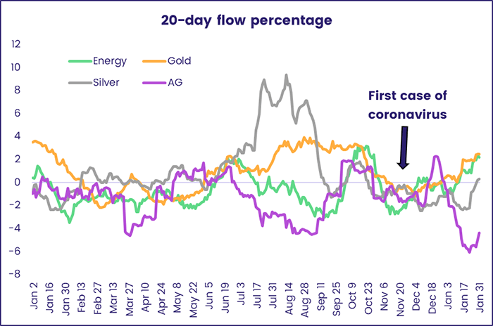
As the chart shows, investors have fled agricultural commodities and silver, increasingly an industrial rather than store-of-value play, in favor of energy and gold since the start of the coronavirus outbreak.
In addition to generating alpha, this model can be adapted to create a statistical risk model. This will be addressed in a future Quant’s Corner.
Did you find this useful? Get our EPFR Insights delivered to your inbox.