EPFR’s Sector Rotation Strategy is one of the staple macro strategies created in recent years by the data provider’s Quant Team.
The signals generated by this trading strategy are derived by combining four as‑reported and aggregated data streams: EPFR’s daily active ETF and mutual fund flows and its monthly Sector and Country Allocations data. The utilization of this strategy, which can be adapted along country and regional lines, helps macro investors to fine‑tune their portfolio allocations in response to shifts in the flows of money chasing – or leaving – different macroeconomic themes.
However, this top‑down approach is not the only avenue open to users of EPFR’s data. The recent updating of its Stock Flows dataset opens the door to building sector‑level factors from the bottom‑up.
The latest version of this security‑level data, released in September last year, covers a larger universe of over 25,000 securities in greater depth with new data columns such as aggregate number of shares held by the EPFR‑tracked funds. This has greatly expanded the array of potential factors available for testing and, by giving users the ability to define specific groups of securities, allows for more complex quantitative modeling.
This piece will outline one example of the signals that can be generated by harnessing specific groups of securities – based on the members of particular sectors, industries, or benchmarks, or by subjectively grouping stocks linked to specific themes – to create a contrarian sector rotation strategy within developed markets, specifically the US and Europe. (Previous research on sector analysis for Japan assets using our traditional approach can be found in one of our earlier Quants Corner pieces, “Unlocking value from Japanese sectors”)
How to get there
Our methodology involves the creation and testing of factors that are constructed from active, passive, ETF, or mutual Fund Flow data, expressed as a percentage of total assets. The goal is to forecast the future performance of equity sectors.
To generate these signals requires the following information:
- EPFR Fund Flows data: Tracks dollar flows to globally‑domiciled and globally‑mandated ETFs and mutual funds, available on a daily basis with a T+2 lag.
- Fund‑level Classifications: Users can differentiate between various fund types, including ETFs, mutual funds, active funds, passive funds, and other sub‑groups like style, geographic mandate, and investor type.
- Stock Flow & Allocations Data: Collected monthly with a T+26 lag, this data is compiled at the security‑level as an aggregation across various funds.
The signal construction methodology can be summarized as follows:
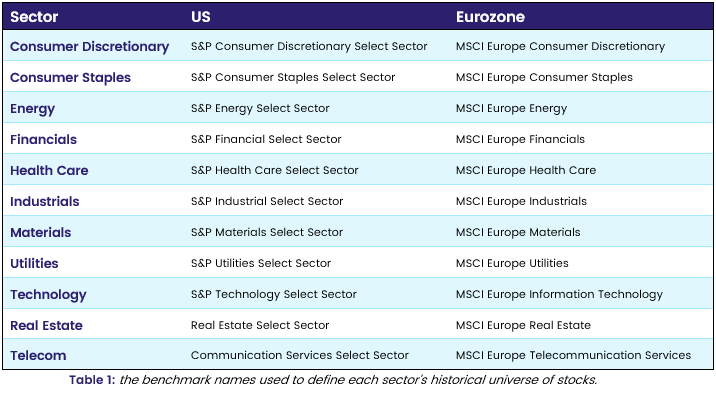
1. Extract the constituents of any fund benchmarked to the indices outlined in Table 1.
2. Calculate the daily dollar flow to each security identified in Step 1. This involves multiplying each active, passive, ETF, or mutual fund’s latest reported month‑end % weight in a security by the total dollar amount invested into, or redeemed from, the fund on a given day.
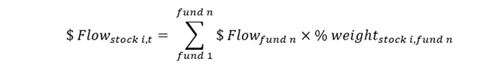
3. Calculate the daily assets under management, AuM, sitting in each security by the same fund groups defined in Step 2.
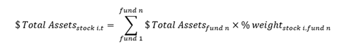
4. Aggregate the stock‑level dollar flow and AuM back up to the sectors to which each security belongs.
5. Divide each sector’s aggregate dollar flow by the total AuM to produce EPFR’s daily Flow Momentum factor, FloMo.
For the US, the S&P select index benchmarks were chosen to identify the relevant securities. For Europe, we opted for MSCI sector index‑benchmarked fund holdings. It’s worth noting that stock‑level country and industry tags are also available, offering the potential for more custom groupings of securities.
Ready to Test
Next, the daily sector‑level flow signals were back‑tested separately within the US or Eurozone universes. The first step was to compound each sector’s daily FloMo data over a trailing 20‑day period. Then, with a weekly rebalancing, each country or region’s sectors were sorted into quintiles based on those 20‑day flows. This was done for each of the major fund types. The simulated portfolio subsequently went long the sectors in quintile 1, and short the sectors in quintile 5, with equal weights.
Tests were run from 2015 until the end of 2022, with the start date reflecting the available history for the selected benchmarks within the Stock Flows data set. The results are tabulated below in Table 2.
US & Eurozone Results: 20-day FloMo
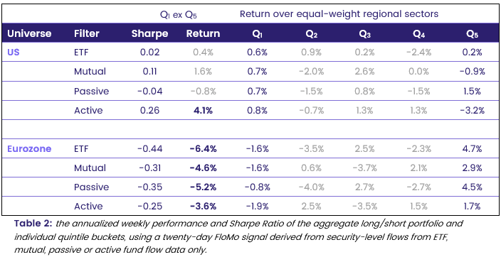
Based on these results, EPFR’s active fund FloMo factor produced the most convincing momentum signal within US sectors, while our ETF and passive fund factors delivered the weakest results for the selected back‑test parameters.
Within European sectors, all of the FloMo factors tested produced negative returns and Sharpe ratios, indicating that the value in this particular signal comes from identifying market reversals. As such, performing the inverse of the back‑test methodology outlined above – invest in quintile 5 sectors and short quintile 1 sectors every week – should therefore deliver a profitable strategy and positive risk‑adjusted performance.
We also ran tests in parallel to compare our new signals against the traditional methodology that uses Sector Allocations data, instead of security‑level holdings. The results appear in Table 3.
Sector Allocations: Average weekly return (annualized)
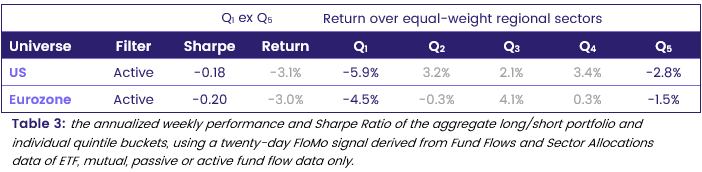
By comparing Tables 2 and 3, it is clear that the Eurozone bottom‑up and Sector Allocations‑based signals produce similar results. The latter achieves a slightly weaker contrarian performance than our newer methodology, reflected in the less negative annualized return and Sharpe ratio.
Conversely, when comparing the signals for US sectors generated by the two approaches, there is a marked difference. Why? Given the narrower scope of the selected S&P Select index constituents used to calculate our bottom‑up signals, relative to the broader universe of stocks captured by Sector Allocations data or MSCI index benchmarks, it is not surprising that the results differ more significantly than is the case with their Eurozone counterparts.
It is also worth noting that EPFR’s security‑level holdings data encompasses a larger universe of funds, at the expense of an additional three days of lag, relative to those generating the Sector Allocations data. With an aggregate coverage of approximately $13.5 trillion and $12.9 trillion in AuM, respectively, for the two datasets, the $600 billion difference is big enough to influence the two signals.
Looking back to get the best signal
Returning to the European sector results, we ran further back‑tests to determine whether other lookback periods could improve portfolio performance. Is 20 days the optimum period, or can shorter or longer windows better predict forward weekly returns?
Compounding 1d FloMo (annualized return & Sharpe)
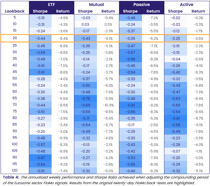
Table 4 demonstrates that the European sector FloMo factor consistently delivers negative returns, irrespective of the selected lookback period for compounding flows or the type of fund used in the signal construction. These negative returns can be translated to positive returns, as noted previously, by going long quintile 5 sectors and short quintile 1 sectors at each weekly portfolio rebalancing. Overall, this pattern suggests that EPFR’s flow data serves as a robust contrarian signal for this region of interest.
Using ETF or passive fund data, the most successful results utilized a FloMo signal compounded over longer periods of approximately 30 or 110 days. Conversely, for mutual or active funds, a more convincing reversal strategy is achieved by applying approximately 70 days of lookback. Additional optimization could improve the performance of these strategies even further.
In conclusion
Utilizing this bottom‑up methodology, the improved Stock Flows data can be harnessed to generate profitable trading signals, providing an alternative approach to sector‑level analysis using EPFR’s data.
More importantly, the option to define and work with specific groups of stocks opens the door to a multitude of further avenues. Some of those will undoubtedly be the subject of future Quants Corners.
Did you find this useful? Get our EPFR Insights delivered to your inbox.